



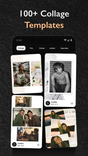
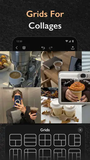
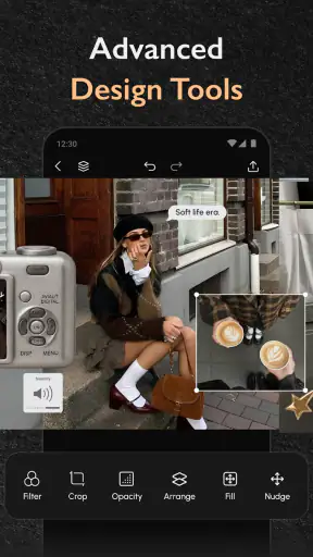
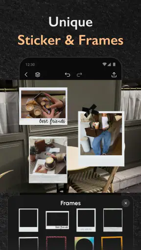

I approached Scroll & Collage Maker: InsMix as a practical photography tool rather than a novelty collage app. Its main appeal is simple: it helps turn several separate images into one polished composition, especially when the final result needs to work as an Instagram post, a seamless carousel, or a longer scrolling layout. After using it for that kind of everyday editing, I found it most useful when I already knew the story I wanted the images to tell. It is not trying to replace a full photo editor, but it can remove a surprisingly awkward step between taking photos and publishing them.
The app comes from Daily Joy Studio and sits in the photography category. It is free to install, suitable for Everyone, and has reached over a million installs. Its average score is 4.6 from roughly twelve thousand ratings, which matches my general impression: the basic idea is easy to understand, and the workflow feels aimed at people who want a finished social image without spending a long time learning design software. The current version is 1.12.3, and optional purchases range from $2.99 to $21.99 per item, so the free experience is worth testing before deciding whether the extra options matter to you.
How I use InsMix from a blank project to a finished post
Start with the story, not the template
My best results began before opening the editor. I first chose the images that belonged together, then decided whether I wanted a clean grid, a continuous visual journey, or a tall composition that someone could browse by scrolling. That small decision matters because the same photos can look intentional in one format and cramped in another. InsMix is much easier to use when the layout follows the content instead of forcing unrelated pictures into a decorative frame.
For a normal collage, I would select a short group of photos and look for a structure that gives each one enough room. Similar images can work well in a balanced grid, while a mixture of portrait and landscape shots usually needs more thought. A portrait photo beside a wide image may leave one subject feeling visually dominant, so I prefer to place the stronger image where the eye naturally lands first. The app makes assembling the group approachable, but it cannot decide which photograph deserves attention. That remains the reviewer’s or creator’s job.
The scroll-oriented workflow is where the app feels more distinctive than a basic collage maker. Instead of treating every image as an isolated tile, I think about transitions: a line, color, person, building edge, or repeated shape that can lead the eye from one section to the next. Even when the photos do not connect perfectly, arranging them with a similar horizon or color rhythm can make a long composition feel less like a stack of unrelated screenshots.
For an Instagram carousel, I would prepare the sequence as if it were a small presentation. The first image needs to make sense on its own, but it should also create a reason to continue. A detail shot can work better near the middle than at the beginning, while a final image with a clear conclusion gives the sequence a more finished feeling. InsMix helps with the visual assembly, but the order still has more impact than a fancy frame or background.
Crop carefully before judging the design
One of the easiest mistakes is evaluating a layout while accepting every automatic crop. A face near the edge, a product label, or the main subject of a travel photo can disappear when the image is fitted into a narrow space. I make a quick pass through every panel and check the subject’s position before adjusting the overall design. This is especially important when combining photographs taken in different orientations.
I also avoid making every image the same visual weight. A collage becomes tiring when each panel competes equally for attention. A large image supported by two or three smaller details often feels more deliberate than a wall of identical boxes. Conversely, if the goal is to show a collection of products, outfits, recipes, or event moments, a more even arrangement can be helpful because viewers may want to compare each item.
The practical lesson is that InsMix works best as a composition tool, not as an automatic taste machine. It speeds up the mechanical parts of arranging images, but the quality of the result still depends on cropping, sequence, spacing, and restraint. I would rather spend an extra minute checking the subject placement than add another visual effect that makes the post harder to read.
The everyday scenario where it earns its place
A realistic example is a small business owner preparing a weekly product post. They might have one image showing the full item, another showing a useful detail, and a third showing it in context. Instead of uploading them as disconnected posts or relying on a plain photo grid, they can build a compact composition that explains the product visually. The same approach works for a café sharing a new menu item, a seller showing clothing details, or a traveler combining a street view with close-up memories from the same place.
I also found the workflow useful for personal events. A birthday, weekend trip, or home project often produces too many similar photos for one attractive image but not enough material for a full album. A carefully edited collage gives those moments a clear shape. The important trick is to remove near-duplicates. If two photos communicate the same thing, keeping only the stronger one creates more breathing room and makes the finished post feel edited rather than merely assembled.
Settings that deserve a deliberate check
InsMix is approachable enough to invite quick tapping, but experienced use comes from pausing over the choices that affect the final image. I pay attention to the layout orientation first. A portrait arrangement usually fits a feed-oriented post more naturally, while a wide composition may be better for a visual comparison or a sequence designed to be viewed across connected panels. Choosing the wrong direction early can lead to awkward cropping later.
Spacing is another setting I treat as part of the design rather than a decoration. Narrow gaps keep a collage compact and can help images feel related. Wider gaps create separation and make each photograph easier to inspect. For a product or instructional sequence, I prefer enough space to prevent neighboring details from blending together. For a mood board, tighter spacing can create a more continuous visual surface.
Background color also changes the perceived quality of a collage. A bright background can make a colorful set of photos feel lively, but it may compete with images that already contain strong colors. A neutral background is safer for mixed photography, although it can look flat if the pictures themselves are subdued. I usually choose a background after arranging the photos, because the images reveal what kind of support they need.
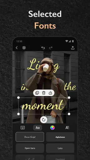
When text or decorative elements are available in the chosen design, I use them sparingly. A short label can clarify a sequence, but too much writing turns a photo composition into a crowded poster. This is one area where a specialized design application may offer more control. InsMix is convenient for getting a visual arrangement together, while detailed typography work benefits from a tool built around text hierarchy, font pairing, and precise alignment.
Before saving, I inspect the edges of the composition at normal viewing size rather than only zoomed in. A thin border, an uneven crop, or a subject placed too close to an edge may be obvious after publishing even if it looked acceptable during editing. I also check whether the first panel of a carousel works as a thumbnail. A design that looks attractive when enlarged can lose its message when reduced on a busy feed.
Repeatable habits make the app faster
The quickest way to use InsMix is not to rush through each project. It is to develop a repeatable selection habit. I create a temporary group of likely images, remove duplicates, and then arrange the survivors in the order I expect people to read them. That prevents the common cycle of repeatedly opening the editor, adding random photos, and rebuilding the layout after discovering that the story has no clear beginning.
I also separate “selection” from “decoration.” First I settle the images, sequence, and crop. Only afterward do I consider spacing, color, and any finishing touches. Mixing those stages encourages over-editing because a decorative choice can make me reluctant to remove a weak photograph. Keeping the stages separate makes the final composition cleaner and reduces wasted effort.
For recurring content, I would keep a personal visual rule rather than trying to reinvent every post. For example, a creator might use a consistent background family, similar spacing, and a predictable first-image structure for weekly updates. InsMix becomes more useful in that situation because it handles the repeatable assembly while the creator maintains a recognizable visual habit. The app does not need to be spectacular every time; it needs to help the process stay consistent.
A useful shortcut in practice is to decide the output format before collecting images. If I know the project will become a tall scroll, I look for photos with enough vertical information and avoid relying only on wide scenes. If I am preparing a carousel, I choose images that remain understandable when separated. This prevents a common disappointment: creating one beautiful continuous composition that becomes confusing once divided into individual slides.
There is also a trade-off between speed and control. A ready-made arrangement can get me close to a finished result quickly, but manual adjustments are usually worthwhile when faces, products, or text are involved. I would accept more automation for casual memories; I would take the slower route for anything representing a business, portfolio, or public announcement.
Where the app’s limits become visible
InsMix is not the right choice for every photography task. If I need detailed retouching, selective color correction, masking, layers, or advanced typography, I would start in a full photo editor or design application. A collage tool can arrange edited images, but it should not be expected to replace the editing stage that makes those images consistent in exposure, color, and sharpness.
It is also less suitable when a project depends on exact brand specifications. A professional campaign may require precise dimensions, reusable brand assets, strict text placement, and fine export control. In that situation, a dedicated design platform gives me more confidence. InsMix is better for quick social content, personal posts, and lightweight visual storytelling than for a production workflow with many approval stages.
Mixed image sizes can create friction as well. A group containing square, portrait, and panoramic photographs may require more manual cropping than a user expects. The app can help organize them, but no layout can preserve every important part of every image at once. If preserving the full frame is essential, I would choose a design that gives each photo more space or prepare versions with matching proportions before importing them.
The free entry point is helpful, but the presence of in-app purchases means I would not assume every appealing option belongs to the no-cost experience. I would begin with a real project rather than browsing decorative possibilities. That quickly shows whether the included workflow covers my needs and whether any optional purchase would solve a genuine problem instead of encouraging impulse editing.
Another limitation is creative discipline. Because arranging photos is easy, it can be tempting to keep adding images until the composition loses its focus. I have found that the app rewards subtraction more than accumulation. Removing one weak panel often improves the result more than changing the background or trying another layout. Users who want an automatic “perfect post” from a large camera roll may find this disappointing, because the strongest decisions still require personal judgment.
Who should use it, and who should skip it
I would recommend InsMix to social users who regularly combine photographs, small businesses that need quick visual posts, travelers building compact trip recaps, and anyone who wants more structure than a single image without learning a complex design suite. It is particularly appealing if seamless movement between images or a scrollable presentation matters to you. The free price makes experimentation easy, and the Everyone age rating keeps the app broadly approachable.
I would be more cautious if your main goal is professional photo correction, elaborate poster design, or exact control over every layer. In those cases, a dedicated editor is likely to be a better foundation, with InsMix used only at the final assembly stage if its layouts suit the project. I would also skip it for a simple one-photo edit; opening a collage maker for that job adds unnecessary steps.
The rating and install count suggest that the concept has found a substantial audience, but popularity should not decide the choice by itself. The relevant question is whether you often need to turn several images into one readable social composition. If the answer is yes, the app can save time. If you mostly publish individual photographs or require advanced retouching, its strengths will matter less than its missing depth.
My final workflow verdict
After using it as a repeatable photography utility, I see InsMix as a focused middle ground. It is more purposeful than a basic grid generator because it supports visual sequences and scroll-friendly compositions, yet it remains less demanding than a full design application. That balance is its clearest strength. I can move from a handful of selected images to a presentable social layout without turning a quick post into a design project.
My advice is to build around three habits: select fewer, check every crop, and choose the final viewing format before decorating. Those habits reveal what the app does well and prevent its simpler controls from becoming a weakness. I would also compare the free workflow with your real publishing routine before considering an optional purchase, especially if you only create occasional collages.
InsMix is at its best when speed, visual continuity, and sensible composition matter more than deep editing control. I would keep it on my phone for travel recaps, product sequences, event memories, and social posts that need several images to feel like one story. I would reach for a more advanced alternative when the project demands professional retouching or strict design specifications. For the right user, that division is not a flaw; it is a clear reason to use this app alongside, rather than instead of, a full photo editor.


